Background...

All students enter school with a combination of "headwinds" and "tailwinds". Tailwinds are the things that make school easier for students. Tailwinds may include factors such as coming from a home with parents of high education levels and economic stability, being a native English speaker, not having a disability, or being a member of the cultural majority. Each of those characteristics plays a role in helping a student experience success in school.

Headwinds on the other hand make school more difficult. Headwinds can include having economic instability at home, parents with lower levels of education, having a disability, or still learning English. The more headwinds a student has, the more difficulty they will have in maximizing their academic potential and the more “tailwinds” they will need. Tailwinds come in the form of high-quality instruction, support, and intervention.

The Academic Support Index, or ASI, quantifies these headwinds. A student’s ASI is the sum of their headwinds. Their ASI can also be considered a measure of the amount of support that they will need in order to mitigate the impact of those educational headwinds. Students with a low ASI will likely need very little additional support outside of Tier 1 instruction. Higher ASI students will likely need proportionally higher amounts of Tier 2 and sometimes Tier 3 supports.

There is a strong relationship between the ASI and academic outcomes including assessments such as the SAT, Smarter Balanced Assessments, AP and IB tests, kindergarten screeners, grade point averages, rates of college eligibility, matriculation, and degree attainment. We have studied these effects over seven years of data as well as across urban, suburban, and rural schools. To date over 400,000 students have been scored on the ASI. (See the featured post below for a list of papers and presentations on the ASI).

Because the ASI is able to reliably predict student outcomes you have to opportunity to interrupt that predictability by using the ASI to make sure that you are identifying the right students for early intervention and support. With effective intervention, predictive analytics can become preventive analytics.

Wednesday, June 15, 2016

A post for schools where all the students might considered to be "at-risk"

A number of schools have asked if the Academic Support Index would help them as "all of our students are at risk."  "At-risk" is a binary categorical variable dividing students into two groups: those who are at-risk and those that aren't.  Is a student a little bit at-risk? A medium amount? A lot?  The term "at-risk" does not tell you the degree to which a student is at-risk for academic under performance. And how is that pool of "at-risk students being identified?  By being poor?  First generation? Having a disability? By race?

The ASI allows one to disaggregate within categories such as "at-risk". The ASI tells you the degree to which a student will benefit from additional supports (or "tailwinds") in order to maximize his or her potential.  

Looking at your student data by ASI levels allows you to do several things:  
1) Identify students more precisely for intervention.  Recall an earlier post describing an intervention using ASI 3+ as the target group.  The results were a 13% increase in the passing rate for our African American students over the three year running average.
2) Monitor performance over time by looking at ASI groups. Any academic performance data including grades, attendance, behavior,  or test passing rates and average scores can be tracked over time along ASI scores to look for school improvement.  The ASI allows you to control for variance  in school composition from year to year.  
3) Comparing student outcomes across schools.  While specific schools can vary tremendously from one another, an ASI 3 is an ASI 3 whether they go to school uptown or downtown.

When you begin to look deeper into categories often considered at-risk, you will see that students within those categories do not perform as a homogenous group. Below are three examples where the policy and/or practice of defining categories as at-risk is both inaccurate and inefficient. In addition to that these categories reinforce stereotypes that are harmful to students. In each example I've disaggregated within the category and examined the results of the Smarter Balanced Assessments. The "meets standards" line is based on cut scores for the 2015 administration.

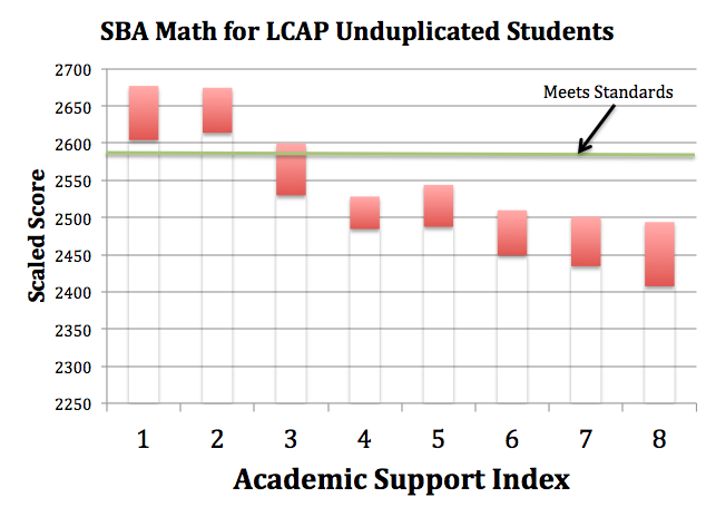
Example 1: California's LCFF
California's Local Control Funding Formula targets students from the categories of socio-economically disadvantaged, English Learners, and Foster youth. (To help the general public understand who the money is supposed to help the state refers to these students as "unduplicated". /s)  The problem with targeting categorical groups is you can end up with a lot of false positives (identifying students as academically "at-risk" who are actually successful). This is demonstrated in the chart below.  When disaggregating the Unduplicated students by the ASI there is a strong correlation (R² = 0.90259) to actual academic performance.  ASI 1 & 2 (representing 20% of the Unduplicated students in this example) are false positives.  Directing resources towards these false positives is an inefficient use of school funds.

(All charts are showing 95% confidence intervals. In all three examples approximately 20% of the students met or exceeded standards. Only ASI performance bands with at least 10 students are shown.)


Example 2: Students with disabilities (R² = 0.84549)


Example 3: Black or African American students (R² = 0.95195)